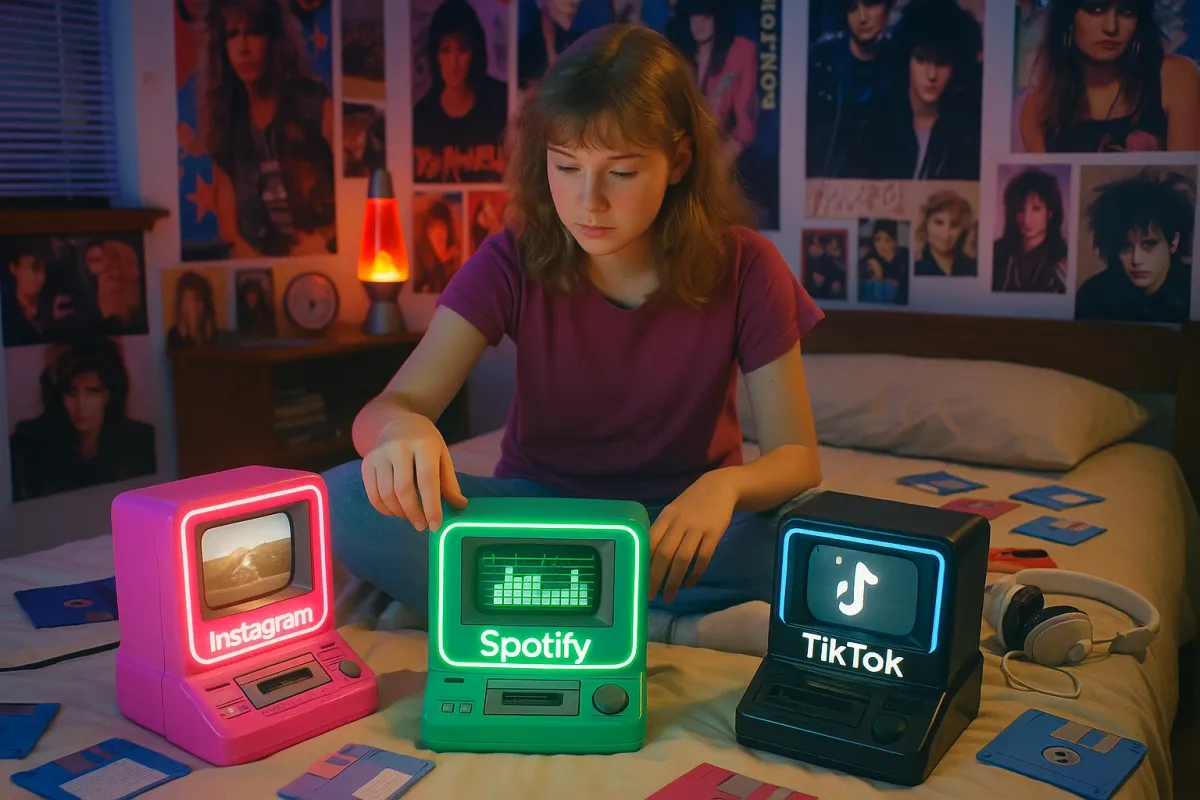
What if Instagram was a Polaroid, Spotify was a Walkman, and Google Maps was that giant fold-out map you could never refold properly? That’s basically the energy behind a viral art series that’s blowing up online right now—reimagining modern apps as chunky, neon‑soaked tech straight out of the 1980s.
Argentinian graphic designer Luli Kibudi, now based in Barcelona, has a project called “Once Appon a Time” that resurfaced on social feeds again this week—and it’s hitting a little differently in an era where apps feel more like infrastructure than tools. The series turns icons like Instagram, Netflix, Spotify, YouTube, and Google Maps into retro gadgets, and people are sharing it like crazy on X, Instagram, and Reddit.
Let’s unpack why this mashup of apps and analog nostalgia is so addictive—and what it says about how we use apps today.
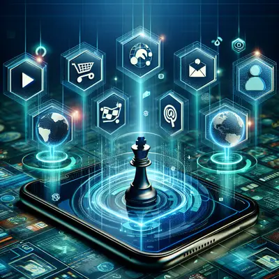
1. Apps Went From “Nice To Have” To “Basically Your Entire Desk Drawer”
Kibudi’s illustrations work because they remind you that every app used to be an actual object:
- Spotify was a stack of CDs, a mixtape, a Walkman.
- Netflix was a rented VHS, a DVD player, cable.
- Instagram was film rolls, disposable cameras, and photo albums.
- Google Maps was an atlas in your car and a very stressed passenger.
In the 80s/90s, all of these things lived in your room, your backpack, or your car. Now they live in one icon on your homescreen. Tech people call this “convergence,” but you don’t need the term—you feel it every time your phone battery hits 3% and your entire life suddenly becomes very fragile.
The art hits because it visually splits your phone back into the dozens of devices it quietly replaced. It’s a reminder: your “apps” are actually entire eras of tech crushed into rectangles.
2. Retro Design Is Trending Because Modern Apps All Look… The Same
Scroll through Kibudi’s fake 80s gadgets and you’ll notice something: they look wildly different from each other. Plasticky, colorful, full of knobs and sliders. Compare that to your current homescreen: a grid of rounded squares, all obeying the same design rules.
Over the last few years, app design has leaned hard into:
- Flat colors
- Minimal text
- Simple icons
- Predictable layouts
It’s clean, sure—but also a little soulless. That’s why retro‑inspired designs keep coming back: neumorphism phases, skeuomorphic throwbacks, grainy textures, and now this full‑send 80s fantasy.
The “Once Appon a Time” series taps into that hunger for personality. A Netflix VHS tape with a bold, worn label just feels more tangible than another red icon. It’s nostalgia, but it’s also a soft rebellion against every app trying to look like every other app.
3. The 1980s Aesthetic Is Having A Full‑On App Moment
This isn’t happening in a vacuum. 80s/early 90s vibes are everywhere in tech right now:
- UI designers are posting neon‑grid Figma concepts that look like they were ripped from an arcade cabinet.
- Some indie apps are leaning into pixel fonts, CRT scanline effects, and synthwave color palettes.
- Retro camera apps keep cycling back into the top charts with fake film burns, VHS filters, and point‑and‑shoot UIs.
Kibudi’s series just plugged into that wave at the right time—and resurfaced again as people shared it alongside shows like Stranger Things, “analog horror” TikToks, and VHS‑styled YouTube edits. It’s all part of the same mood: we’re obsessed with high‑tech, but we’re craving low‑tech texture.
If you build or obsess over apps, this is the trend to watch: interfaces that feel less like sterile tools and more like weird little objects you’d actually want to hold.
4. These Illustrations Low‑Key Expose How Addictive Our Apps Really Are
Seeing Instagram as a chunky 35mm camera or Spotify as a tape deck is cute… until you realize how different the relationship is.
Old hardware had built‑in friction:
- You had to change tapes.
- You ran out of film.
- Stores closed.
- Batteries died and you couldn’t just plug into any wall.
Modern apps removed almost all of that friction. Infinite scroll. Auto‑play. Algorithmic playlists that never end. Notifications tuned to hit your brain like a casino. You go from “I’ll check this one thing” to “how is it 2am?” in a single scroll.
The 80s versions in Kibudi’s series feel charmingly limited—because they were. You had to stop. And that contrast quietly highlights how “infinite” our current apps are designed to be.
It doesn’t scream “screen addiction!” like a thinkpiece, but it plants the idea: maybe the old friction wasn’t always a bug. Sometimes it was a boundary.
5. Why Tech People Are Eating This Up: It’s The Perfect “What If?” Playground
If you hang around designers, devs, or app nerds, this project hits a very specific itch: speculative UX. It’s basically one big thought experiment:
- How would Instagram work if you only had 24 shots of film?
- What would “scrolling” Netflix look like on a shelf of VHS tapes?
- How would you “skip” songs if your playlist was literally a mixtape?
Those mental games are fun—but they also help you understand what actually matters about an app. Is Spotify about the UI, or about instant access to any song? Is Google Maps about the map visuals, or about turn‑by‑turn confidence that you won’t get lost?
That’s why this series keeps getting shared in design Slacks, product channels, and nerdy corners of X: under the retro candy coating, it’s quietly asking, “If we stripped away the screen, what’s left of this app?”
That’s catnip for anyone who cares about how tech is built.
Conclusion
Luli Kibudi’s “Once Appon a Time” series is going viral again because it’s doing three things at once: scratching our nostalgia itch, calling out how same‑y modern apps look, and nudging us to think about what these apps really replaced.
It’s a reminder that your phone isn’t just “some apps”—it’s a whole desk, a stereo, a camera bag, a video store, and a glovebox full of paper maps, all collapsed into a device thin enough to forget in your hoodie pocket.
Next time you open your favorite app, imagine the 1980s hardware version of it. Would you still use it as much? Would it still feel essential? That tiny thought experiment alone might change how you see the icons you tap 100 times a day.
Key Takeaway
The most important thing to remember from this article is that this information can change how you think about Apps.