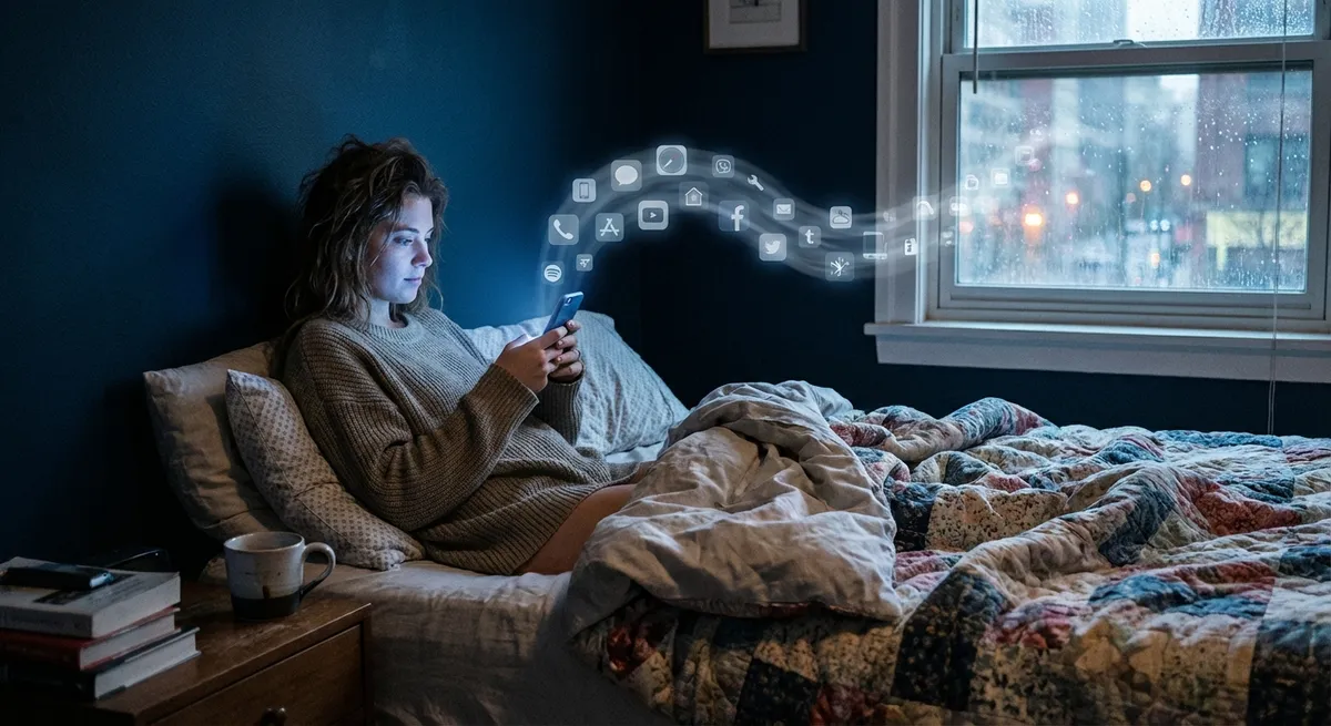
There are apps you download, try once, and forget.
Then there are the apps you open on pure muscle memory—without even realizing you tapped them.
Those “autopilot” apps say a lot about where tech is headed, what actually hooks us, and how design quietly shapes our daily habits. Let’s dig into some surprisingly cool things happening in app land right now—no hype, just the stuff that’s actually interesting when you look under the hood.
1. Your Apps Are Learning Your Routine (Whether You Notice or Not)
You’ve probably seen this already: your music app knows your Monday mood, your maps app guesses where you’re going, your calendar suggests events before you type them.
That’s not magic, that’s pattern-spotting.
Modern apps quietly track when, where, and how you use them to start predicting your next move. Open your fitness app every morning around 7? It’ll pre-load your favorite workout. Order food every Friday night at 8? The app will surface that same burger spot without you even searching.
This “predictive” behavior has two big effects:
- It makes apps feel weirdly personal, even though you never changed a setting.
- It turns routines into default choices—what’s suggested is what most people tap.
The interesting part: we talk a lot about screen time, but not much about “suggestion time”—how often we let recommendations decide for us. The more your apps guess correctly, the less you think about alternative options. Super convenient… but also a subtle way tech shapes taste, routes, and habits.
If you’re curious how much this is happening:
Turn off “personalized suggestions” or “activity-based recommendations” in just one go-to app for a week. Notice how much more effort it suddenly takes to do the same stuff.
2. The Best Apps Don’t Look Complicated—They Hide the Complicated Parts
Some of the most advanced apps you use feel almost… boring. Simple screen, big buttons, nothing flashy.
That’s on purpose.
Modern app design is all about hiding complexity behind very obvious actions. Think:
- Tap one giant button → a car shows up.
- Drag a slider → your photo looks better.
- Long-press a message → a whole menu appears.
Underneath that, there are wild amounts of logic, code, and infrastructure. But none of that matters to you. What matters is: does it feel stupidly easy to do the thing I came here to do?
Tech people sometimes call this “abstraction.” You never see the hard part.
What makes this fascinating is that we’ve hit a point where:
- The apps that look simple are often the most advanced technically.
- The apps that look advanced (tons of buttons, menus, widgets) are often just… cluttered.
If an app feels like it’s constantly asking you questions—notifications, pop-ups, weird settings—it’s probably pushing complexity onto you instead of hiding it. The best-designed apps make you feel smart, not overwhelmed.
3. Offline Mode Is Quietly Making a Comeback
Not long ago, the assumption was: everything will be online, all the time. Then reality happened—spotty Wi-Fi, travel, dead zones, data caps, and “Why is this app useless on a plane?”
Developers got the hint: offline is back in style.
You’ll see this in more places than you think:
- Map apps that let you download entire cities.
- Note apps that sync later but work fine with no connection.
- Translation apps that store languages offline.
- Some streaming apps that let you cache songs or episodes.
The cool part: offline support isn’t just a backup plan—it changes how apps are built. Data has to sync gracefully, handle conflicts, and not freak out when your signal flips between 5G, Wi-Fi, and nothing.
For you, it means this: the line between “online app” and “offline tool” is blurring. Your phone is less of a remote control for the cloud and more of a mini-computer again.
If you travel, commute underground, or just hate buffering, it’s worth digging into your favorite apps’ settings. You might find surprisingly powerful offline features you never knew existed.
4. Tiny Visual Details Are Doing Big Psychological Work
You know when a button “pops” just right, or a toggle switch animates in a satisfying way? That’s not just for fun. Visual micro-details are doing heavy lifting on how an app feels.
A few examples you’ve probably seen without thinking about:
- Micro-animations: A button pulses when you tap it, a card slides smoothly into place, icons wiggle slightly when something’s loading. These tell your brain: “Yes, your tap registered. Something is happening. Don’t panic.”
- Color choices: Green usually means “go / accept,” red means “stop / danger,” blue often means “safe / neutral.” Apps lean hard on this to reduce hesitation.
- Haptics: That tiny vibration when you complete an action? It feels satisfying—and it’s there to make the app feel more “real” and responsive.
Why this is interesting: the core tech of many apps is similar. What actually hooks people is often not the feature list, but how pleasant (or annoying) the little details feel in daily use.
Next time you really like—or really hate—an app, pay attention to:
- How it responds to your touch.
- How often it surprises you (in a good or bad way).
- Whether it explains what’s happening… or leaves you guessing.
You’ll start seeing patterns in what makes some apps feel “smooth” and others feel like a chore.
5. Your App Stack Is Becoming Part of Your Identity
At this point, “What apps do you use?” is honestly as revealing as “What music do you like?” or “What games do you play?”
The apps you keep on your home screen say a lot about you:
- Are you productivity-obsessed (to-do lists, calendars, automation)?
- Creative-first (photo editors, drawing, music tools)?
- Social-heavy (messaging, short video, live audio)?
- Wellness-focused (sleep trackers, meditation, step counters)?
There’s even a kind of unspoken social signal: screenshots of home screens on social media, “What I use” posts, or people swapping app recommendations the way they used to share playlists.
From a tech perspective, this is fascinating because:
- Apps are less about single tasks now and more about ecosystems—notes that sync with calendars that talk to tasks that plug into cloud storage.
- You can build a “personal tech stack” almost like building a custom PC, except it’s all software fitting together on your phone.
If you’re a tech enthusiast, it’s worth occasionally auditing your own setup:
- Which apps do you actually open daily?
- Which ones are just sitting there because you meant to use them?
- Where are you using three apps for something one well-chosen app could handle?
Treat your apps like gear: tune them, upgrade, and retire the ones that don’t earn their spot.
Conclusion
Apps aren’t just “little programs” anymore. They’re:
- Predicting your next move,
- Hiding serious complexity behind one-tap actions,
- Working harder offline than they used to,
- Using design psychology to guide your attention,
- And quietly becoming part of how you present yourself to the world.
If you’re into tech, it’s worth looking beyond “What does this app do?” and asking “How is this app shaping the way I think, choose, and move through my day?”
You don’t have to use fewer apps. But being a bit more intentional about the ones that earn your daily taps? That’s where the real upgrade is.
Sources
- [Google Design – Material Design Guidelines](https://m3.material.io/) – Official design system from Google that shows how modern apps think about motion, color, and interaction.
- [Apple Human Interface Guidelines](https://developer.apple.com/design/human-interface-guidelines/) – Apple’s design principles for apps on iOS and other platforms, with insights into simplicity, feedback, and usability.
- [Mozilla – What does your data say about you?](https://blog.mozilla.org/en/internet-culture/mozilla-explains/what-does-your-data-say-about-you/) – Explains how apps and services infer patterns about your behavior from usage data.
- [Nielsen Norman Group – The Role of Microinteractions in UX](https://www.nngroup.com/articles/microinteractions/) – A deep dive into why tiny animations and feedback cues matter so much in app design.
- [Microsoft – Designing for Offline](https://learn.microsoft.com/en-us/windows/uwp/design/networking/offline) – Technical but accessible overview of how apps are increasingly built to handle unreliable or missing network connections.
Key Takeaway
The most important thing to remember from this article is that this information can change how you think about Apps.